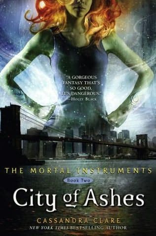
Here is the original:
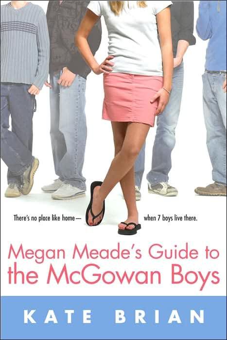
And here is the other:
Personally, I like the first one. Its much more detailed, and more provoking than the other one. Though, the second one is a little bit more mysterious looking.
Which one do you like?
Also, do you like my blog layout? Just wondering!


5 comments:
I like the first cover better too!
I like your blog layout but for some reason I have to scroll to the bottom to see your posts when I'm using my computer.
I have never seen the second cover before. I think that the first cover is the best, I like the picture in the first one.
I like your layout. =]
I had seen the second before too, someone sent me a sample chapter with that cover and i was like "whoa!" it's pretty neat, definitely different than the others
I like both just the same :D
I love your new layout it's cute.
Yep I think I definitly love the first cover and am a little creeped out by the second. I think the first cover realtes to the story more than the other one does too. :]
I really don't like the UK cover, so I bought the US one. I think it's just boring!
Post a Comment